In this assignment, you are to develop your abilities and skills using Adobe Illustrator to recreate a historical and famous masterpiece. You should consider the following criteria when you are recreating the masterpiece.
Masterpiece Criteria:
100% of painting is re-covered. I recommend that you completely fill areas that you are redrawing.
Accuracy- colours, lines, contours, graduated fading variable brush strokes
Likeness- the image still retains similar likeness to the original work.
Creativity- you put a bit of your own flair in the new master piece.

Sunday, February 28, 2010
Friday, February 26, 2010
Sharing Logos List of Assignments
Were are going to finish sharing logos and designs that you are proud of. Then if we finish with sufficient time, we will continue to work on the redraw of a famous painting in Illustrator.
Make sure you have the following assignments posted to your blog before the end of next week:
Make sure you have the following assignments posted to your blog before the end of next week:
- Elements of Design- 5 examples and definitions.
- 9 Fonts- 3 Serif, 3 Sans Serif and 3Decorative/Script. Describe font and list ways they could be used.
- Abstract Fonts- Choose a letter and a sans serif font and expand it until it is barely recognizable. then reverse it.
- 5 Logo Designs- Choose font, use initials and simplify to represent you.
- Master Piece- Redraw in Illustrator (due March 5th).
Thursday, February 25, 2010
Wednesday, February 24, 2010
Tuesday, February 23, 2010
Sunday, February 21, 2010
Drawing Symbols
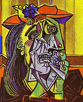
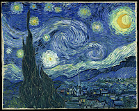
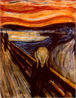
When you finish your logo, you will be re-drawing an Illustrator symbol. Choose one and trace over top. Make sure you create a new layer and draw in the different layer-Window-Layers- add a new layer using the pop-down window on the top right corner of the layer pallet. Use e layer to draw over top/trace the symbol. Try using the pen tool, and don't fill until you have the basic shape traced. When you finish, try another symbol that is more challenging. Add your oun colours. Then look into drawing a famous work of art. Here are a few to choose from. You can select your own, but you must show me first. I want it to be challenging enough, but not too challenging for you. If you start, then remember to use layers.

Thursday, February 18, 2010
Sharing Logos
We are going to project your chosen favourite logo design and have a class critique/share. Make sure you export your best logo design to a jpeg format and upload it in your blog.
Wednesday, February 17, 2010
Logo Criteria
Your logo design should reflect something about you, your personality, interests, abilities and skills through colours, font, symbolism, arrangement of elements, and design.
We are using Adobe Illustrator as a tool to construct the logos. You are going to become familiar with the text tool, character window, the fill and stroke, colour and swatch palettes, create outlines abilities, the effects menu choices.
In the end you are to have developed your idea visually and then simplified it so that it is easy to recognize and remember. Include the 5 Principles: Simple, Memorable, Timeless, Versatile, and Appropriate.
Marking Criteria Check List (each is marked out of 5 for 20 total):
Post your five logo designs on your blog. Choose your best logo and identify it. Briefly explain how your logo reflects who you are and why you designed it the way you did.
- Simple design- lines, shapes, color are reduced to only minimum necessary to communicate ideas.
- Basic elements- easy to read and understand.
- Eye catching & memorable- different than any other logos.
- Thoughtful & appropriate- represents self.
Tuesday, February 16, 2010
Friday, February 12, 2010
More Illustrator Tools
 Today we are going to work on further developing you personal logo. **Remember to try 5 variatioins of the same font design, but different arrangements.
But first I'm going to show you a few more fun things about the Illustrator tool bar and then I will show you how to make a symbol.
Thursday, February 11, 2010
Creating a Logo
Creating a Logo~ You are continuing to create a personal logo using Abobe Illustrator.
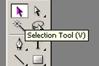 Today we are going to manipulate and adapt fonts by using the "Type">"Create Outlines" function in Illustrator. Start with a simple font that reflects something about you. Type your initials and arrange them in an interesting way. Make sure to use the Selection Tool (black arrow) to select the text box before you click on Create Outlines.
Then use the Direct Selection Tool (white arrow) to click and drag the various points arround your text/initials to manipulate and mould the font to suite you. You can change colour, apply a gradient, or an interesting effect to your font once you have applied Create Outlines.
Wednesday, February 10, 2010
Personal Logo
Personal Logo
First finish your Abstract Letter Assignment.
Watch these You Tube Videos:
Typolution
Helvetica* Then design your own personal logo using only your initials.
* Research logos that use only letters to represent companies.
* Select a font that suits your personality.
* Type your initals. You can repeat your letters more than once.
* Abstract your initials.
* You can Stretch, Bold, Italic... your letters.
* You can select a colour other than black.
* Try 5 different variations.
* You can add a simple symbol that represents you.
* Select your best style and post it on your blog.
Monday, February 8, 2010
9 Fonts
Here is an example of Assignment #1 font exercise. Finish finding 3 examples for each styles, describing and then brainstorming places where it would be used. Save the Illustrator file and the File>Export> as a jpg format. Then upload the jpg to your blog.

Subscribe to:
Posts (Atom)