We are going to work on HTML vocabulary to further develop your ability to control the organization of information and further options of web page design.
Headings: Are bold, bigger and move the next sequence of text to the next line
<H1 > the biggest</H1 > to <H6 > the smallest</H6 >.
Paragraph of Text: <p > and you have to close with </p >
Text Alignment: <div align="right" > or you can align it in the centre </div >
Hexidecimal Colour Code: #RR GG BB make sure to put a number sign in front and numbers 1-9 or letters A-F to represent the colour. for example #990000 = red. Here is a hexidecimal colour chart a better hex chart.
Text Colour: <font color="blue" >
Text Style: <font face="Arial" >
Text Size: <font size="+1" >
Line Break: <br > is a break to another line, no closing tag required
Image: <img src="name_of_your_photo" >
Link to Another Page, relative URL= <a href="page2.html" > type something to click on here</a>
Link to Another Site on the internet, absolute URL= <a href="http://www.website" > type something to click on here</a>
Tags within the opening <"BODY"> tag
Link tags to change the colour of your links use these attributes in the <body> tag:
link= change the link colour
alink= changes the link colour when you are clicking on it
vlink= changes the colur of your link after you have visited it
bgcolor= changes the colour of your page
background= changes the image on the background of your page
Lists
Numbered List <ol >
Buletted List <ul >
You need to put a <li > before and after each item on te list </li >
then make sure to close the ul or ol </ol > or </ul >
Lissa Explains html Tutorial
w3schools

Monday, October 16, 2017
Final Logo Critique
Post your final logo design to your blog. Briefly explain how your logo reflects who you are and why you designed it the way you did- your personality, interests, abilities and skills through colours, font, symbolism, arrangement of elements, and design.
How have you developed your idea to visually and to simplify it so that it is easy to recognizable and memorable.
Marking Criteria Check List (each is marked out of 5 for 20 total):
- Simple design- lines, shapes, color are reduced to only minimum necessary to communicate ideas.
- Basic elements- easy to understand.
- Eye catching & memorable- different than any other logos.
- Thoughtful & appropriate- represents self.
HTML Basic
We are going to learn how to make basic web pages using HTML. There are many HTML tutorials that you can explore. http://www.lissaexplains.com/ is a good one; it looks kind of childish, but easy to follow. HTML glossary is nicely organized, and HTML Tutorial is a good one too.
- Create a "Webpage" folder in your Design folder.
- Open "Note Pad" in the Start menu- Accessories-Note Pad.
- Type the following:
Type the following:
<html>
<head>
<title>Choose your own site title, and type it in here.</title>
</head>
<body>
Everything that appears on your site will be entered here (text, images etc.), between the body tags.
</body>
</html>
Then save as "my_1st_webpage.html"
Open Internet Explorer File>Open>
Tuesday, October 10, 2017
Principles of Design
Principles of design can be thought of as what we do to the elements of design. How we apply the principles of design determines how successful we are in creating a work.
Principles of Design:
Balance
Emphasis
Harmony&Unity
Movement
Pattern
Proportion
Repetition
Rhythm
 Balance
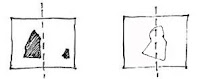
Balance in design is similar to balance in physics, the symmetrical arrangements of elements. Balance is the concept of visual equilibrium, and relates to our physical sense of balance. It is a reconciliation of opposing forces in a composition that results in visual stability. Most successful compositions achieve balance in one of two ways: symmetrically or asymmetrically.
Emphasis
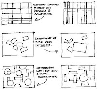
Emphasis gives an interest, counteracting confusion and monotony. Emphasis can be applied to one or more of the elements to give dominance. A focal point draws your attention to the most important element on the page.
Harmony & Unity
Harmony is the visually satisfying effect of combining similar, related elements. ie. adjacent colours on the colour wheel, similar shapes etc.
Unity Where several different element arranged in a way to convey an overall feeling of one composition.
Movement
Elements within the design give visual direction - Horizontal, Vertical or Oblique. Horizontal suggests calmness, stability and tranquility. Vertical gives a feeling of balance, formality and alertness. Oblique suggests movement and action. Learn methods for controlling where a viewer will look in a composition.
Proportion and scale are principles of art that describe the size, location, or amount of one element in relation to another. They have a great deal to do with the overall harmony of an individual piece and our perception of the art
Pattern/Repetition/Rhythm
Pattern is a repeated element within a design to create a systematized, unified consistent or characterized arrangement.
Repetition is an element that is introduced to design more than once.
Rhythm is a variation of repeated elements, without variation repetition can become monotonous.
The Assignment
YOU CAN
Use multiples of the letter.
Different sizes.
Different colour.
Select a particular font. (Keep it simple though).
YOU MUST NOT
Change the font
Change the character of the font ie. bold or italic or (god-forbid) underline.
Use different letters from the alphabet- once you select a letter, stick to it.
OR
2.1 Design your business card using each of the principles of design.
Principles of Design:
Balance
Emphasis
Harmony&Unity
Movement
Pattern
Proportion
Repetition
Rhythm
 Balance
Balance in design is similar to balance in physics, the symmetrical arrangements of elements. Balance is the concept of visual equilibrium, and relates to our physical sense of balance. It is a reconciliation of opposing forces in a composition that results in visual stability. Most successful compositions achieve balance in one of two ways: symmetrically or asymmetrically.

Emphasis
Emphasis gives an interest, counteracting confusion and monotony. Emphasis can be applied to one or more of the elements to give dominance. A focal point draws your attention to the most important element on the page.
Harmony & Unity
Harmony is the visually satisfying effect of combining similar, related elements. ie. adjacent colours on the colour wheel, similar shapes etc.
Unity Where several different element arranged in a way to convey an overall feeling of one composition.
Movement
Elements within the design give visual direction - Horizontal, Vertical or Oblique. Horizontal suggests calmness, stability and tranquility. Vertical gives a feeling of balance, formality and alertness. Oblique suggests movement and action. Learn methods for controlling where a viewer will look in a composition.
Proportion and scale are principles of art that describe the size, location, or amount of one element in relation to another. They have a great deal to do with the overall harmony of an individual piece and our perception of the art
Pattern/Repetition/Rhythm
Pattern is a repeated element within a design to create a systematized, unified consistent or characterized arrangement.
Repetition is an element that is introduced to design more than once.
Rhythm is a variation of repeated elements, without variation repetition can become monotonous.
The Assignment
- Find an example of design for each of the principles and post it on your blog.
- Then we are going to select one letter and using InDesign create the Principles of Design using the one letter. See instructions below...
YOU CAN
Use multiples of the letter.
Different sizes.
Different colour.
Select a particular font. (Keep it simple though).
YOU MUST NOT
Change the font
Change the character of the font ie. bold or italic or (god-forbid) underline.
Use different letters from the alphabet- once you select a letter, stick to it.
OR
2.1 Design your business card using each of the principles of design.
Sunday, October 1, 2017
Business Card Designs

You are to design a business card for your self. The business/service can be real ie. to offer a service that you already do, or it can be a dream job, or a fictional occupation. The main objective is to develop a business card that represents your service effectively and creatively. So first take a look at some designs that represent the service symbolically. Business cards typically are 2" x 3.5" in size.
Assignment 1- Business Card Research
Find 5 interesting/inspiring business card designs and post them to your blog.
Here are some sites to get you started:
Cool Business Cards
More Cool Business Cards
Assignment 2-Business Card Design Project
How to Design a Business Card Video
- Identify the service that you are promoting.
- Develop a logo (you already have this and slogan (brief description of service).
- Consider contact information- How do you want to be contacted? i.e. email. website. address. phone. cell. fax
- Identify the person named on the card.
- Organize information in a creative and eye catching way to personalize your business card and represent your organization/service.
- Brainstorm ideas- sketch, doodle, consider your look and the overall concept...10 ideas. Use principals of design to guide your various design ideas. Try the square design.
- Create your card 2" x 3.5" using Illustrator
- Organize InDesign.
Subscribe to:
Posts (Atom)