Thursday, June 17, 2010

List of Projects for Term 2

Make sure you bring a flash drive to save all of your work June 25th.

Term 2 Projects- make sure you upload all projects to your blog, but save the html to the Shared- 00Design- Final Web Sites file put a file with your name in there so I can see your work.

  • InDesign Promo- Clothing
  • InDesign Promo- Bus Stop/Transportation ad
  • Photoshop- Portrait aka Andy Warhol
  • Html - 1st Web Page
  • Html- Checkerboard Table
  • Html- Link Site
  • Flash- Mini Animation
  • Flash- Button
  • Flash- Intro Splash to web site with link to web site

We will have a class sharing at 10am.

Tuesday, June 15, 2010

Flash Web Site

For your Flash Website title page, you will need the following:
  • Title/heading
  • Short animation to suit your business
  • Button to link to your other websites
  • Colours match design concept
  • Layout resembles business design

Monday, June 7, 2010

Friday, June 4, 2010

Mini Animation

Create a super short animation using the following Flash techniques:
  1. Create Symbol- Main subject.
  2. 2 + Layers (include a background layer).
  3. Motion Tween.
  4. Shape Tween
  5. Motion Guide.
  6. Ease of the Motion.
  7. Tween Alpha or Colours.
  8. Short story with main character with conflict and resolution.

Tuesday, June 1, 2010

Flash Button Tutorial

Here is the Flash 3.0 button tutorial:
http://www.youtube.com/watch?v=LUJkqzCM3L4
it's 20 minutes long.

Friday, May 28, 2010

Flash Sites

Check out some flash web page designs and then find some to post to your blog to share with the class on Monday. You can also try another Flash tutorial from yesterday's blog.

Tokyo Plastic
http://www.designsbyvw.com/
http://www.narrowdesign.com/
http://www.richardwarddesign.com/
http://www.homestarrunner.com/
http://www.hoogerbrugge.com/nails/

Now g0 find some of your own

Thursday, May 27, 2010

FLASH!

We are going to learn how to use Flash CS4. I am going to introduce the basics of starting a Flash document to help you navigate through the program. Then we will go through some tutorials together:

Flash Wars

Basic Flash Tutorial

Creating Motion in Flash

More Flash Tutorials

Wednesday, May 26, 2010

Flash and Self Directed Project

It looks like we are going to work on Flash animation/web design and a self directed project and that could be a Google Banner or two ot three...

But today let's work on the Dreamweaver web page and getting to know how to use the program. Later I will show you a little about CSS and then tomorrow, we will begin to work with Flash.

Tuesday, May 25, 2010

15 Days Left...

Choose the top 2 projects that you are interested in learning until the end of the year:
  1. Flash Web Design
  2. CSS- Cascading Style Sheets
  3. Self-Directed Project
  4. Google Banner Design

Dreamweaver Web Page Design

We are going to explore Dreamweaver, the Adobe web page design developer application. This program makes html, css, php and many more web page design language easier and more accessible. It is easy to use, as it colour codes the tags (anything in the >< )
  1. Heading
  2. Link to original page from index page to this one
  3. A paragraph of information
  4. 1 or more images
  5. Match colors and fonts to index page
  6. Design pages in a similar, but creative way.

If we have time, I will show you how to make a roll over button.

Friday, May 14, 2010

Web Page Design

We are going to work on HTML vocabulary to further develop your ability to control the design and organization of your page.

First we are going to prepare an image in photoshop. Reduce your resolution and lower the overall size of your image, it must be in RGB.

Image: <img src=" name_of_your_photo">
Link to another page, relative URL= <a href="page2.html" > </a>
Link to another site on the internet, absolute URL= <a href=http://www.website/ </a>

Link tags to change the colour of your links use these attributes in the <body> tag:
link change the link colour
alink changes the link colour when you are clicking on it
vlink changes the colur of your link after you have visited it

<br> is a break to another line
If we have time, we are going to start to organize your information in tables.

Tuesday, May 11, 2010

Warhol Portrait

Here is the final Portrait ala Andy Warhol. Make sure you include nine of your digitally manipulated portraits arranged in a grid. Save it with layers first and then flatten the image to one layer and save it as a low - medium quality JPEG file and post it to your blog.

Wednesday, April 21, 2010

Business Card>Public Transit Ad & Clothing Item


You may have noticed many different adaptations of a similar design during the Vancouver Olympics 2010. I want you to 1st explore and research how the designers tranfered the design concepts through out the various venues. Collect 5+ different Olympic design variations.
Next, I want you to re-visit your business card design and tranfer that idea to different formats. For this design project, adapt your favourite business card design to fit 2 other promotional spaces- Public Transit Ad and T-shirt.

  1. The Public Transit Ad
  2. Clothing Item (t-shirt, hat, hoodie...)


Thursday, April 15, 2010

List of Projects for Term1

  1. Elements of Design found examples
  2. 9 Found Fonts descriptions
  3. Abstract Letter
  4. Redraw a Symbol
  5. Personal Logo
  6. Masterpiece
  7. 10 Business Cards
  8. Best Business Card

Wednesday, April 7, 2010

The Servant of Two Masters Poster Design


Hey Designers-
We have been given a job! The poster for the drama production of The Servants of Two Masters. I underestimated our time though. I was trying to allow you to complete your business cards and then start the poster, but we are taking too long. So we must interrupt the business cards and design the poster and we only have three days. It is from the 20s era, so we have to look into " art deco" designs

So I want to break up the design into 4 or 5 parts 2 to 3 students working on each part:
  1. Border- Seomi, Susie
  2. Flapper-girl in caricature- KyuRi
  3. Silhouettes of men in top hats behind girl- Maria, YeJi
  4. Title- Marissa, Jill, Erin
  5. Supporting text- Ann, DaHae
  6. Art Deco-rative Graphics- JiYoung, Tyler

Consider art deco style text, illustrations, and graphics. It is a very distinct era.

Flappers


Alphonse Mucha


Charles Rennie Mackintosh Designs


Which part(s) do you want to do?

Wednesday, March 31, 2010

Work Period Today

Your 10 business card design variations are due tomorrow at the end of class.

Tuesday, March 30, 2010

Creating a Template in Illustrator

I am going to show you how you can assemble your 10 business card designs together on one page.

  1. Using Adobe Illustrator, you should open a letter sized print document 8.5 x 11.
  2. Then select "Show Rulers" under the "View" menu.
  3. Find centre of the document. Create guide lines by clicking inside of the rulers and then dragging a grid line onto your document (these are only imaginary lines, they will not print out). First create a vertical centre line pull the line to 4.25 inches and then a horizontal centre line pull the line to 5.5 inches so you should have the lines crossing in the very centre of your document.
  4. Draw a top guide line and a bottom guide line on your template 0.5 inch from the top and 0.5 inch from the bottom.
  5. Create the side guides 0.75 of an inch in from both vertical sides of the document.
  6. Open your business card files and select all- Control+A or "Select" menu and "Select All". then group all of the parts Control+G or "Object" menu and "Group". (You may want to draw a temporary 2" x 3.5" border around your business card so you can place each card correctly on the template).
  7. Copy your card design and then Paste into the template
  8. Repeat steps six and seven ten times to fill the template.
  9. "Save As" the document "10business cards.ai".
  10. Convert the file to a "jpg" to add to your blog. "File">"Export">"10business cards.jpg"
  11. Then select your best design out of the ten different ideas and assemble 10 on one page to print them out.
  12. "Select All" then "Delete" the 10 different card designs from the template.
  13. Repeat steps six and seven, but this time paste the same design onto the template 10 times.
  14. "File">"Save As" your document so you create a new file.
  15. Print your 10 same designs onto business card paper using the Epson printer.

Monday, March 29, 2010

Business Card Work Period 3

Business Card Work Period 3

Friday, March 26, 2010

Business Card Work Period

I will help you work on your ideas today. Ask if you want help.

Wednesday, March 24, 2010

Illustrator Demonstration

Today I am going to show you different options in using the text tool. We are going to use the rotate tool to spin the text. And then I am going to show you how to type on a path.


Monday, March 22, 2010

Elements- Lines, Shapes, Colour, Texture

How are you going to organize your text in your business card design? Consider all of your information as chunks of text when you are developing your designs. Think of the text as visual elements of your card, not just providing information. After you try designing your business cards using the top 5 typographic systems (from the previous post). Select your favourite layout and then try the following by adapting the use of the following:

  1. Line breaks- Lines may be broken at will to make multiple lines.
  2. Word and letter spacing (kerning, tracking) - varying letter or line spacing creates different textures. As letter spacing is increased, the word spacing must also increase to avoid confusion.
  3. Leading- can be tight to overlapping or wide and airy
  4. Shapes (circle, square, triangle)- Shapes can draw attention to specific information
  5. Colours & tones- Using colour or tone can change the emphasis in a design. The eye will be drawn to a different colour or tone than the majority of the space.
In the end, you are to have 10 different business card designs.

Typographic Systems

Typographic Systems- Visual Systems of Organizating Text

  1. Axial System- All elements are organized either to the left or right of a single axis.

  2. Radial System- All elements extend from a point of focus.

  3. Dilational System- All elements expand from a central point in a circular fashion.

  4. Random System- Elements appear to have no specific pattern or relationship.

  5. Grid System- A system of vertical and horizontal divisions.

  6. Modular System- A series of non-objective elements that are constructed as standardized units to contain text.

  7. Transitional System- An informal system of layered and shifted banding lines of text.

  8. Bilateral System- All text is arranged symmetrically centred on a single axis.

Overview of a Typography & Design course


Wednesday, March 17, 2010

Work Period Today

Try to finish your masterpiece and start designing your business cards.

Sunday, March 14, 2010

Welcome Back

I hope you had a great break.

Let's share the Masterpiece projects today. Some of you are finished, some of you are nearly complete, and others have lots to do. So we will figure out how to finish once we see them.

Some may want to work ahead on the next assignment Business Card design.

Wednesday, March 3, 2010

Masterpiece Work Period

Work on your Masterpiece today. I will be available to help you, if you need it. The Masterpiece project is due Friday.

Sunday, February 28, 2010

Re-Masterpiece

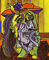
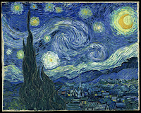
In this assignment, you are to develop your abilities and skills using Adobe Illustrator to recreate a historical and famous masterpiece. You should consider the following criteria when you are recreating the masterpiece.

Masterpiece Criteria:
100% of painting is re-covered. I recommend that you completely fill areas that you are redrawing.
Accuracy- colours, lines, contours, graduated fading variable brush strokes
Likeness- the image still retains similar likeness to the original work.
Creativity- you put a bit of your own flair in the new master piece.

Friday, February 26, 2010

Sharing Logos List of Assignments

Were are going to finish sharing logos and designs that you are proud of. Then if we finish with sufficient time, we will continue to work on the redraw of a famous painting in Illustrator.
Make sure you have the following assignments posted to your blog before the end of next week:
  1. Elements of Design- 5 examples and definitions.
  2. 9 Fonts- 3 Serif, 3 Sans Serif and 3Decorative/Script. Describe font and list ways they could be used.
  3. Abstract Fonts- Choose a letter and a sans serif font and expand it until it is barely recognizable. then reverse it.
  4. 5 Logo Designs- Choose font, use initials and simplify to represent you.
  5. Master Piece- Redraw in Illustrator (due March 5th).

Thursday, February 25, 2010

Share

Let's show it off today. Choose an assignment that you are proud of and share it today.

Wednesday, February 24, 2010

Tuesday, February 23, 2010

Work Period

Today we work on Illustrator assignments, tomorrow we share.

Sunday, February 21, 2010

Drawing Symbols

When you finish your logo, you will be re-drawing an Illustrator symbol. Choose one and trace over top. Make sure you create a new layer and draw in the different layer-Window-Layers- add a new layer using the pop-down window on the top right corner of the layer pallet. Use e layer to draw over top/trace the symbol. Try using the pen tool, and don't fill until you have the basic shape traced. When you finish, try another symbol that is more challenging. Add your oun colours. Then look into drawing a famous work of art. Here are a few to choose from. You can select your own, but you must show me first. I want it to be challenging enough, but not too challenging for you. If you start, then remember to use layers.


Thursday, February 18, 2010

Sharing Logos

We are going to project your chosen favourite logo design and have a class critique/share. Make sure you export your best logo design to a jpeg format and upload it in your blog.

Wednesday, February 17, 2010

Logo Criteria

Personal Logo Design
Your logo design should reflect something about you, your personality, interests, abilities and skills through colours, font, symbolism, arrangement of elements, and design.

We are using Adobe Illustrator as a tool to construct the logos. You are going to become familiar with the text tool, character window, the fill and stroke, colour and swatch palettes, create outlines abilities, the effects menu choices.

In the end you are to have developed your idea visually and then simplified it so that it is easy to recognize and remember. Include the 5 Principles: Simple, Memorable, Timeless, Versatile, and Appropriate.

Marking Criteria Check List (each is marked out of 5 for 20 total):
Post your five logo designs on your blog. Choose your best logo and identify it. Briefly explain how your logo reflects who you are and why you designed it the way you did.

  1. Simple design- lines, shapes, color are reduced to only minimum necessary to communicate ideas.

  2. Basic elements- easy to read and understand.

  3. Eye catching & memorable- different than any other logos.

  4. Thoughtful & appropriate- represents self.
(Versitile- created in Illustrator as a vector graphic.)


    Tuesday, February 16, 2010

    Work Period

    Work Period- finish 5 logo designs.

    Friday, February 12, 2010

    More Illustrator Tools

    Today we are going to work on further developing you personal logo. **Remember to try 5 variatioins of the same font design, but different arrangements.

    But first I'm going to show you a few more fun things about the Illustrator tool bar and then I will show you how to make a symbol.

    Thursday, February 11, 2010

    Creating a Logo

    Creating a Logo~ You are continuing to create a personal logo using Abobe Illustrator.

    Today we are going to manipulate and adapt fonts by using the "Type">"Create Outlines" function in Illustrator. Start with a simple font that reflects something about you. Type your initials and arrange them in an interesting way. Make sure to use the Selection Tool (black arrow) to select the text box before you click on Create Outlines.

    Then use the Direct Selection Tool (white arrow) to click and drag the various points arround your text/initials to manipulate and mould the font to suite you. You can change colour, apply a gradient, or an interesting effect to your font once you have applied Create Outlines.

    Wednesday, February 10, 2010

    Personal Logo

    Personal Logo
    First finish your Abstract Letter Assignment.

    Watch these You Tube Videos:
    Typolution
    Helvetica

    * Then design your own personal logo using only your initials.

    * Research logos that use only letters to represent companies.

    * Select a font that suits your personality.

    * Type your initals. You can repeat your letters more than once.

    * Abstract your initials.

    * You can Stretch, Bold, Italic... your letters.

    * You can select a colour other than black.

    * Try 5 different variations.

    * You can add a simple symbol that represents you.

    * Select your best style and post it on your blog.

    Monday, February 8, 2010

    9 Fonts

    Here is an example of Assignment #1 font exercise. Finish finding 3 examples for each styles, describing and then brainstorming places where it would be used. Save the Illustrator file and the File>Export> as a jpg format. Then upload the jpg to your blog.