Sunday, September 24, 2017

Typographic Systems-> Poster Design


Visual Systems of Organizing Text

TED: David Carson [Design & Discovery]
  1. Axial System- All elements are organized either to the left or right of a single axis.
  2. Radial System- All elements extend from a point of focus.
  3. Dilational System- All elements expand from a central point in a circular fashion.
  4. Random System- Elements appear to have no specific pattern or relationship.
  5. Grid System- A system of vertical and horizontal divisions.
  6. Modular System- A series of non-objective elements that are constructed as standardized units to contain text.
  7. Transitional System- An informal system of layered and shifted banding lines of text.
  8. Bilateral System- All text is arranged symmetrically centred on a single axis.

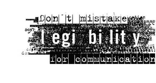
Find a statement (preferably relating to design, or motivation) and type it out using a simple font.

Then, organize your text using the above typographic systems. Create a new poster for each of the above, so you should have 8 different ways of organizing the quotes.

You can incorporate colour, images, scale, spacing, leading/kerning, rotating... you can type the quote many times in the same poster.

Use the different typographic styles to make sense of your quote. You can try typing with a few different fonts, but try to stay with one font for each poster. Post the 8 poster variations to your blog when you are finished. 

Then...
Evaluate each poster design-identify the typographic system that you tried in each poster. Explain how your design is an example of the typographic system. Maybe define the typographic system based on your poster design.

Identify your best poster design, explain why it is your best design.

Fight Club- Kinetic Font Example 1
Fight Club Example 2


Stephan Sagmeister


Monday, September 18, 2017

Helvetica


We are explore typography through the documentary Helvetica:
Helvetica Movie Trailer 

Helvetica the Movie 

Consider the following questions while you watch the movie, we will have a discussion after we watch the film, then post the answers to your blog:


  1. Name 10 places where you see Helvetica in the movie.
  2. How would you describe Helvetica?
  3. Life as a designer…
  4. Massimo compares typography to music. What is the distinction of both.
  5. What can Helvetica be used for? What does it communicate?
  6. Helvetica is called a rational type-face- why?
  7. What is typography?
  8. List some [3-5] negative points about Helvetica as commented in the film.
Helvetica Assignment: Post brief overview of Helvetica- history, description,of the font, and or some observations from the documentary. Find [3-5] examples of Helvetica used in graphic design and post to your blog. [Due Wednesday].

Personal Logo Development

Logo Development
Before you further develop your personal logo, read through the following websites:

Logo Definition
In your blog, briefly define what a logo is.

How to Design a Logo
Read through #2- 5 Principals of Effective logo design.
Compare the three logos and their effectiveness in section #3- Successes and Mistakes.

View the following links and take note particularly the note the evolution of Olympic logos. Notice how they continue to be simplified; the lines, shapes, colours are reduced to the most simple possible. Logos are like poetry, they say the most with the least amount of marks made.

Evolution of Pepsi and Coca-Cola Logos
Olympic Logos

Now take a look at your logo and simplify-minimize-develop ideas-add-subtract-design and redesign... try five different variations of your final personal logo. Try to simplify each with design, but make sure you communicate the basic essence of who you are somehow and keep it simple. When you finish your 5 logo variations, post them on your blog.

If you finish, you will be re-drawing an Illustrator symbol. Choose one and trace over top. Make sure you draw in a different layer- Window-Layers- add a new layer and use it to draw over top/trace. Try using the pen tool, and don't fill until you have the basic shape traced.

Thursday, September 14, 2017

Monday, September 11, 2017

Personal Logo

Stephan Sagmeister: Happiness by Design


Start by exploring who you are and what to represent:
Who are you (or describe your organization/business)?
Write out 5-10 qualities about yourself/business that you would want to promote.
Highlight the qualities that you want to symbolize.
What are you selling? Who is your audience? What are you promoting?

Then design a personal logo using only your initials:
  1. Select a simple font that suits your personality.
  2. Type your initials. You can repeat your letters more than once.
  3. Re-organize and abstract your initials.
  4. Experiment with the combination: Stretch, Squish, Flip, Reflect, Bold, Italic, Overlap, Colour... your letters.
  5. You can select a colour other than black.
  6. Try 20+ different variations. Post your variations on your blog. 
  7. Select your best.
Final Design
  1. Then fine tune your final design.
  2. Keep it simple
  3. Professional.
  4. Isolate your best logo on a single document.
  5. Post it on your blog. 


About You

Write a short post with information, photos, design ideas about you and your interest in design.
  •  Write about you and your interests in Design. 
  • Find visual examples of things that you are interested in learning this semester: What aspects of design interests you? 
  • What programs might be relevant to you in the future? 
  • What do you want to design?

Wednesday, September 6, 2017

Starting a Blog

    We are going to brainstorm and keep track of ideas through a blog. Here are the steps to start your own blog.

    If you have a Gmail account already follow these steps:
    1. Go to Google and sign in.
    2. Select Blogger in the pop down window to create new blog. or you can use a different blog platform like Wordpress.
    3. Follow the steps to name and set up your style ie Billy's Blog, or Mary's Designs.
    4. Then email your blog address to me to dusher@sd35.bc.ca 
    If you don't have a Gmail account, follow these steps:
    1. Google> "Blogger- Create new Blog"
    2. sign in with the following information
    3. login: lfasdesign11.12@gmail.com            password: lfas1234
    4. Create Blog
    5. I will give a demonstration.
    6. Ask if you need help, or visit this tutorial if you need help:
    https://support.google.com/blogger/answer/1623800?hl=en
    • Personalize your blog with colours, fonts, backgrounds. 
    • As we create new work, we will personalize it even more with a profile photo etc. 
    • We are going to start with a banner.
    Good luck and happy blogging!

    Abstracting Fonts

    Objectives: Learn how to explore the font as an element of design to be creative with the line, shape, and space of the letter. Also learn how to use basic Adobe Illustrator as a tool for creating design.

    Instructions:
    Part 1 - Abstracting a letter in Illustrator
    1. Set up an 8.5 x 8.5 document using Adobe Illustrator.
    2. Select two letters from the alphabet (could be your first initial).
    3. Then choose a bold Sans Serif Font.
    4. Using the "T' tool, type the letters on the page. Draw the box for the letter covering the whole page before you begin. 
    5. Select the letter with the "T" and adjust the font size to fit the whole page.
    6. Use the "direct selection tool to select the letter box.
    7. Try the "scale" tool to expand the letters- keep the proportions equal, but make the letter really big.
    8. If you use two letters, set the tracking so that they touch, but not overlap.
    9. Make the letter so large that you cannot recognize it anymore, but not too big that it still holds the essence of the letter.
    10. You can use the rotate tool also.
    11. As you move the letter on the page, consider the new shape an expressive line. Be particular about how it looks.
    12. Save it to your file and export it "save for web and devices" as a jpg- upload it to your blog (make a blog).
    Part 2 - Invert it and flip it
    1. Make the black parts white and the white parts black- hint you may have to make the background black.
    2. Draw a box behind the letter and fill it with black.
    3. Use the "T" tool to select the letter and then change the color from black to white.
    4. The select the letter with the direct selection tool.
    5. Spin/flip the letter corner to corner- you can transform and flip horizontally, or the reflect tool.
    6. Make sure it is an exact mirroring of the previous letter.
    7. Repeat step 10 in Part 1
    Part 3-  Make a nine + part mosaic of your letters in Photoshop
    1. Start a new document in Photoshop.
    Selection, Direct Selection, Group Selection Tools
    Scale Tool
    Rotate Tool

    Tuesday, September 5, 2017

    Welcome to Digital Design


    Design is like poetry. Complex ideas are broken down to the most simplest elements to easily understand, but can convey many more meanings and possible interpretations.


    The Red Wheelbarrow
    by William Carlos Williams
    
    
    so much depends
    upon
    
    a red wheel
    barrow
    
    glazed with rain
    water
    
    beside the white
    chickens.


    Designers are visual communicators and storytellers. They use strategic thinking and processes to integrate form and function to inspire, inform, educate, and/or entertain in 2D and 3D media.

    This course will expose and highlight the presence of design in our everyday surroundings. And explore the importance of design in our everyday lives.

    Students will investigate various methods of design ideation to creation. Students will be challenged with various design tasks and assignments while learning how to use design based programs: Illustrator, Photoshop, InDesign, Dreamweaver.


    Digital Design Course Outline:

    Basic Design- Illustrator

    Typography- Playing with Text using InDesign

    Logo/Business Card- Illustrator and InDesign


    Famous Designers
    Designer- David Carson

    Self-Portrait Poster- Photoshop and Illustrator


    Self-Directed Project- Identity