Sunday, January 17, 2016

Term 2 Check List


Logo Initials Design Ideas x 10 


10.0

Logo Initials Design Final


10.0

Symbolic Logo Design Ideas x 10


10.0

Symbolic Logo Final


10.0

Logo Research


10.0

Typographic Systems


25.0

Business Card Research


5.0

Business Card Design Ideas x 10


50.0

Business Card Design Final


10.0

5x5x5 Designer Research


25.0
Butterfly Effect Logo Design x 10 Ideas


10.0 

Make sure all of your assignments from the list above are posted to your blog


Current assignments will not be posted on your blog, but will be saved to a file on the "STUDENT SHARE" folder

HTML Exercises-  (10)
Basic Page with Colored Headings, Links, Checkerboard Table, make sure that they all link together
HTML Web Site Specific Topic- (20)
CSS [Cascading Style Sheets]- (10)
Adobe Dreamweaver-


Monday, November 9, 2015

Butterfly Effect Logo

Assignment: Design a logo to represent the Butterfly Effect Program at LFAS. 
Current Butterfly Effect Logo
First consider why it should be changed. What parts of the current logo works? And what parts don't represent the program? What does it communicate? What could this stand for? What would work for the logo, what sort of image would better communicate the Butterfly Effect program?
Some information about the program:
Butterfly Effect is a global, cross- curricular community where students work collaboratively to guide their own learning and support the learning of others.

The name, and philosophy of Butterfly Effect, comes from chaos theory, which states that a small change in one system can result in large differences in a later state. Butterfly Effect students move beyond school curriculum to discover and research areas about which they are passionate.

Students share inquiry based projects online with the support of mentors and peers from other schools, and countries. We enlist engineers, historians, physicians, chefs, artists, and other global professionals to support and guide student learning. This provides students in Canada and Kenya the rare opportunity to exchange ideas with students and professionals in other countries.
The Butterfly Effect Website:
The Butterfly Effect Definition:
The scientific theory that a single occurence, no matter how small, can change the course of the universe forever.
1. A man travelled back in time to prehistoric ages and stepped on a butterfly, and the universe was entirely different when he got back.

2. The flap of a butterfly's wings changed the air around it so much that a tornado broke out two continents away. 
Step 1: Research the butterfly effect theory and the program. Truly understand the essence of the Butterfly Effect. Make some notes in your journal/blog.
Step 2: Find visual examples and ideas that may work for the concept- Butterfly Effect.
Step 3: Re-imagine/combine visuals to create something new and appropriate. Make some quick sketches of ideas either on paper or digitally.
Step 4: Bring your ideas to computer. Take your sketch and simplify your idea and break it down to the simplest components. Try 10-20 different variations of your idea and try a few different ideas. Step 5: Post your ideas to your blog and to the share folder.

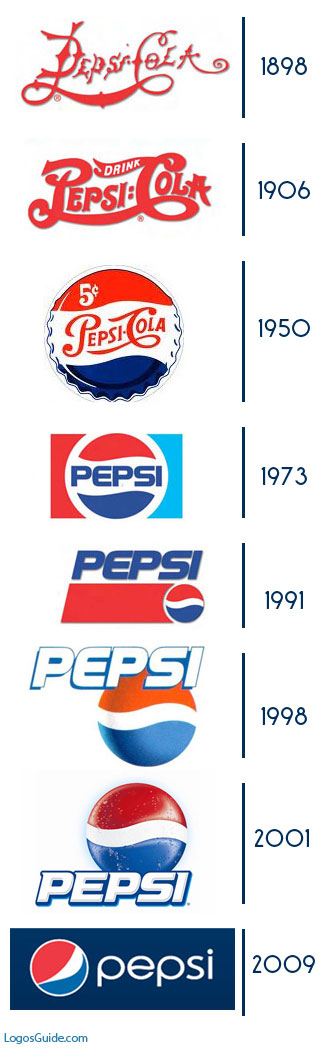
Evolution of a Logo

Logo Development
Before you further develop your logo, read through the following websites:

Logo Definition
In your blog, briefly define what a logo is.

How to Design a Logo
Then list and define the #2- 5 Principals of Effective logo design.
Compare the three logos and their effectiveness in section #3- Successes and Mistakes.

View the following links and take note particularly the note the evolution of Olympic logos. Notice how they continue to be simplified; the lines, shapes, colours are reduced to the most simple possible. Logos are like poetry, they say the most with the least amount of marks made.

Evolution of Pepsi and Coca-Cola Logos
Olympic Logos

Post the definition and logo design tips to your blog.

The % below identifies the percentage of these 50 brands that hold to this view:
  • The name does not describe the product sold (94%) (ie. in most cases a logo is used to identify a company, not describe what it does.)
  • The by-line tag is not included in the logo (90%)
  • The font style is clean and clear (84%)
  • The logo design uses one colour only (74%) (white & black not counted as a colour)
  • The logo design uses letters only without the symbol (74%)
  • The logo design is a made-up name or ACRONYM (72%)
  • The logo design is rectangular in shape (66%)
  • The logo design is one word only (62%)
  • The logo design includes the trademark symbol (54%) and is placed in the top right (48%)
  • The name is 6 letters or less (52%)
  • The name uses upper & lower case (44%) (excluding ACRONYMS)
  • The background is filled and solid. (52%)
  • The pronunciation includes three sounds/syllables (44%)
  • The predominant colour base is blue (40%)
.

Friday, November 6, 2015

Logo Research

Logo research assignment: Find 5 symbolic logos (not with text) and post them to your blog.
  • Describe the image/logo and any visual clues. 
  • Explain what the company does/produces/sells. 
  • Identify how the image represents the company. 
  • Then evaluate the logo and it's effectiveness in representing the company and the products.
 

Monday, November 2, 2015

Personal Logo 2- Simple Symbol


Simple Symbol Logo Design to Represent You:
  1. Write a list of your attributes/personal qualities.
  2. Find visual examples that represent you to get some ideas.
  3. Choose one or two that works for you.
  4. Trace or draw, scribble, and simplify the image.
  5. You could form your letters from previous assignment into something that visually represents you, or create a simple line drawing.  
  6. Simplify-minimize-develop ideas-add-subtract-design and redesign... Your logo should be the simplest rendering of the image, could be just about energy or your attitude.
  7. Try 10 or more different variations of your personal logo. Try to simplify each with design, but make sure you communicate the basic essence of who you are somehow and keep it simple. When you finish your 10 logo variations, post them on your blog.
  8. Try 10+ different variations.

Sunday, October 25, 2015

Abstracting a Letter in Illustrator

Explore the physical shapes of letters by abstracting a letter (basically blow up a type face).
  • First set-up your page 8.5" x 8.5" square.
  • Then select the "T" tool,
  • Adjust the font to something Sans Serif, or a simple serif.
  • Set the colour to black (it is the default).
  • Adjust the size to fit whole page or beyond (each font responds differently in size).Use the scale tool to enlarge the font to extend beyond the print borders, size and the rotate to turn it, but don't flip or reflect it or stretch, or skew. 
  • If it doesn't get large enough, then try to object>create outlines and then scale your letter.
  • Abstract the letter so that you can barely recognize the letter, but retain the basic qualities of the letter to be able to identify it (with work). It sounds easy, but it is quite challenging to keep 'em guessing.
  • Save As "AbstractLetter1.ai" 
  • Then File> Save for Web and Devices- Select jpg and maximum quality.
Reverse your text and background so it is white text and background is black and letter is mirrored.
  • Add another layer for the background
  • Use the square tool and draw a background across the whole doc
  • Select black for the fill.
  • Select the letter using the "T" tool to  
  • Then turn the fill to white and stroke to black.
  • Use the reflect tool
  • Flipped so it could be read in the mirror (if it wasn't abstracted).
  • Save As "AbstractLetter2.ai" 
  • Then File> Save for Web and Devices- Select jpg and maximum quality.
  •  Post both Abstract Letters to your blog.
  • Then print out each letter. We will tack them on the board and have a guessing game.