Principles of Design:
Balance
Emphasis
Harmony&Unity
Movement
Pattern
Proportion
Repetition
Rhythm
 Balance
Balance in design is similar to balance in physics, the symmetrical arrangements of elements. Balance is the concept of visual equilibrium, and relates to our physical sense of balance. It is a reconciliation of opposing forces in a composition that results in visual stability. Most successful compositions achieve balance in one of two ways: symmetrically or asymmetrically.

Emphasis
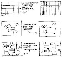
Emphasis gives an interest, counteracting confusion and monotony. Emphasis can be applied to one or more of the elements to give dominance. A focal point draws your attention to the most important element on the page.
Harmony & Unity
Harmony is the visually satisfying effect of combining similar, related elements. ie. adjacent colours on the colour wheel, similar shapes etc.
Unity Where several different element arranged in a way to convey an overall feeling of one composition.
Movement
Elements within the design give visual direction - Horizontal, Vertical or Oblique. Horizontal suggests calmness, stability and tranquility. Vertical gives a feeling of balance, formality and alertness. Oblique suggests movement and action. Learn methods for controlling where a viewer will look in a composition.
Proportion and scale are principles of art that describe the size, location, or amount of one element in relation to another. They have a great deal to do with the overall harmony of an individual piece and our perception of the art
Pattern/Repetition/Rhythm
Pattern is a repeated element within a design to create a systematized, unified consistent or characterized arrangement.
Repetition is an element that is introduced to design more than once.
Rhythm is a variation of repeated elements, without variation repetition can become monotonous.
The Assignment
- Find an example of design for each of the principles and post it on your blog.
- Then we are going to select one letter and using InDesign create the Principles of Design using the one letter. See instructions below...
YOU CAN
Use multiples of the letter.
Different sizes.
Different colour.
Select a particular font. (Keep it simple though).
YOU MUST NOT
Change the font
Change the character of the font ie. bold or italic or (god-forbid) underline.
Use different letters from the alphabet- once you select a letter, stick to it.
OR
2.1 Design your business card using each of the principles of design.

No comments:
Post a Comment